Outfit coordination can be difficult, but just because it doesn’t mean you can’t experiment with different colors and put together some stylish, fashionable color coordinated outfits.
Emotion is evoked by color. It has an inspirational effect on our perception. Color is undoubtedly the most effective tool at your disposal if you’re into fashionable color coordinated outfits because of its impactful and communicative character.
Fabric and fit are the two cornerstones of every well-put-together fashionable coordinated outfit, and as fashionistas, we must be conscious of this. Color, and specifically how you mix and match different hues within your appearance, is also crucial. If you’ve ever wondered how someone manages to make a color coordinated outfit appear so amazing, it’s usually because they focus on these three aspects of style.
Though it may appear to be more difficult than it is, I can help you out by giving this simple suggestion for putting together some cool fashionable coordinated outfits. Color Theory, I promise you that this important suggestion is simple to implement and experiment with, so keep reading to discover more about how to color match and how to put together a coherent ensemble.
FASHION COORDINATED OUTFITS- Color Theory
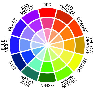
Familiarise Yourself With The Color Wheel
The natural sequence of the color wheel is red, orange, yellow, green, blue, indigo, and violet, which I’m sure most of us remember from art class. The most widely held belief is that you should pair opposites. For example, blue with orange or green with red. In actuality, though, these pairings are likely to be excessive. As a result, when it comes to fashion, you must also consider Hue, Saturation, and Brightness while creating a coherent palette.
- Primary colors: red, yellow, blue
- Secondary colors: orange, green, violet (created by mixing primary colors)
- Tertiary colors: red-orange, yellow-orange, yellow-green, blue-green, blue-violet, red-violet (created by mixing both primary and secondary colors)
- Complementary color combinations: colors on opposing sides of the color wheel are known as complementary colors. The combination of these hues provides a high-contrast effect that catches the eye and has a big impact. Red and green, yellow and purple, orange and blue are some examples.
- Analogous colors are every two to five colors on the color wheel that are next to each other. These color choices convey a sense of harmony and balance. One of these is usually in the background, while the other, more prominent color is in the foreground.
Examples: yellow, yellow-green, and green; violet, red-violet, and red; red, red-orange, and orange; blue, blue-violet, and violet.

Contrast adds to your ensemble while matching colors in the appropriate palette produce coherence. Consider it as though you were building a ‘theme’ of colors by adjusting the hue, saturation, and brightness levels of each color in the palette.
We all have particular colors that we enjoy and look best in, so make the hues that make you feel most confident the focal point of your wardrobe; this should be a wonderful place to start for your fashionably coordinated ensembles.
FASHIONABLE COORDINATED OUTFITS IDEAS – Color Theory
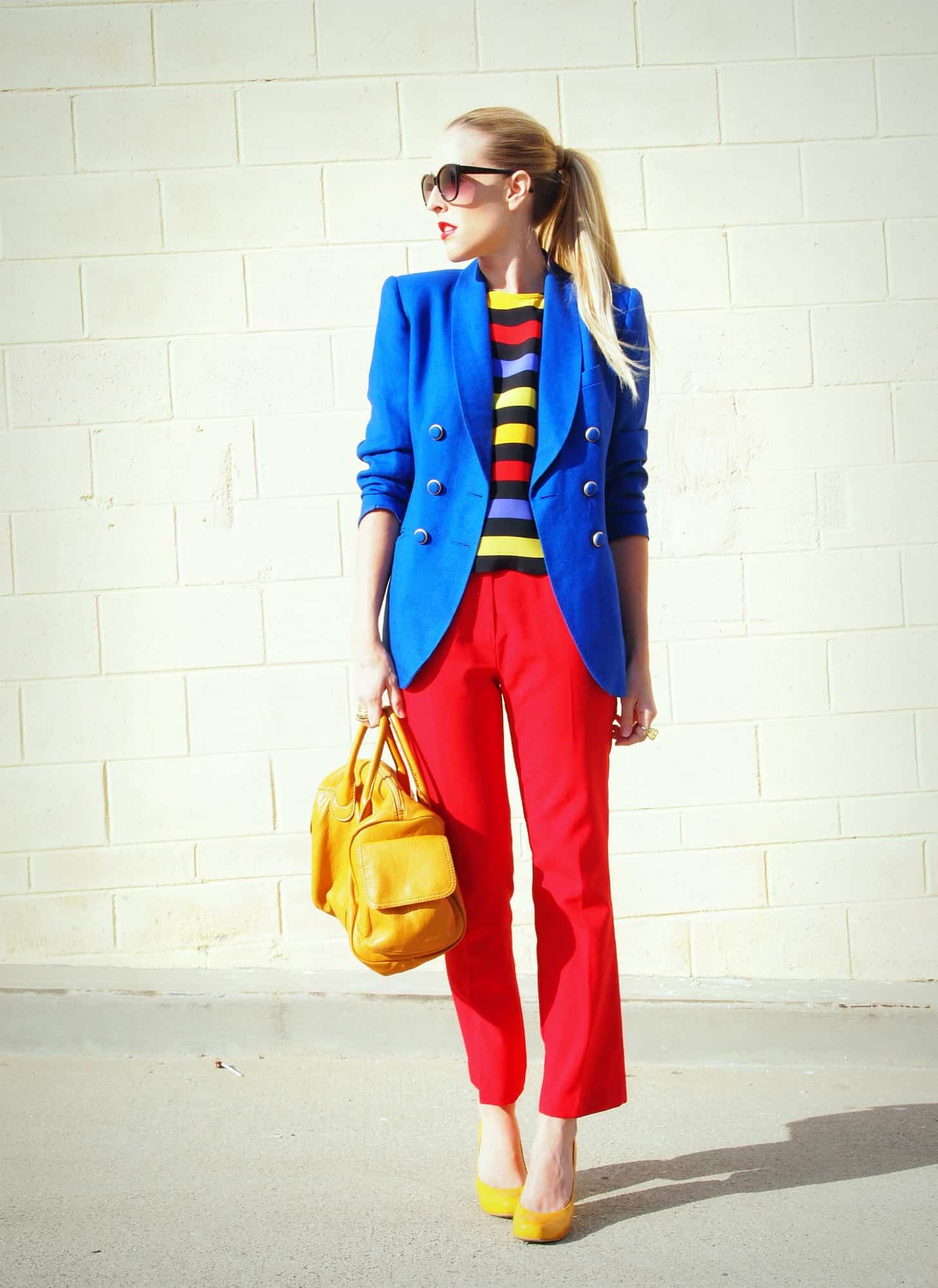
PRIMARY- COLORS COORDINATED OUTFIT

Here primary colors are shown. Red, Blue, and Yellow.
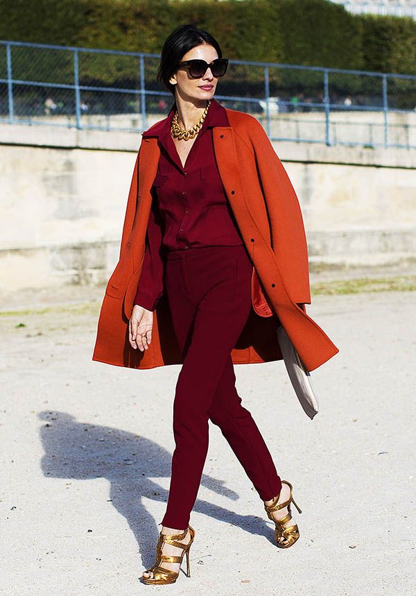
ANALOGOUS- COLOR COORDINATED OUTFIT

Analogous colors blend with each other when paired together. Examples: pink and red; blue and purple; green and blue; orange and burgundy. The feel here is a cohesive and harmonious soft gradation of color.
COMPLEMENTARY- COLOR COORDINATED OUTFIT

These contrast each other — hence making each other seem more vibrant when paired together. Examples: yellow and purple; green and red; blue and orange; blue-green and red-violet. The effect is a really popping contrast of color that creates a sometimes electric, high-voltage look!
CONCLUSION
It’s crucial to grasp color perceptions and relationships; in fact, it’s safe to say that it’s essential, especially when color coordinating. Feel free to undertake as much study as you want on the color wheel to solidify your knowledge of color science.
PHOTO CREDITS: GOOGLE IMAGES
Check Out My Latest Blog: https://fashonation.com/2022-reusable-press-on-nails-set/
Check Out My Blogs: https://fashonation.com/members/be-you_trendy868/blog/
Start Blogging: https://fashonation.com/
Local SEO Services: https://marketprosdigital.com/
Follow Me On Pinterest: https://pin.it/3wtaw7z
Shop Using $1 Products With Referral link: https://www.shopmissa.com/?rfsn=6445339.5365716
Shop StansOut Beauty Co: https://stansoutbeauty.com/?sca_ref=1791777.t8LpG9AdjN
Recommended6 recommendationsPublished in apparel, Jewelry, Petite, Plus Size, Shoes
